

LOGO contest
Hi everyone!
Version française en cliant sur ce lien;)
Today, I want to show you my contribution to a LOGO contest created by the Federation of student associations in my university (FAE).
The contest was set up in order to replace the current LOGO that doesn't really have a meaning:

My idea is pretty simple:

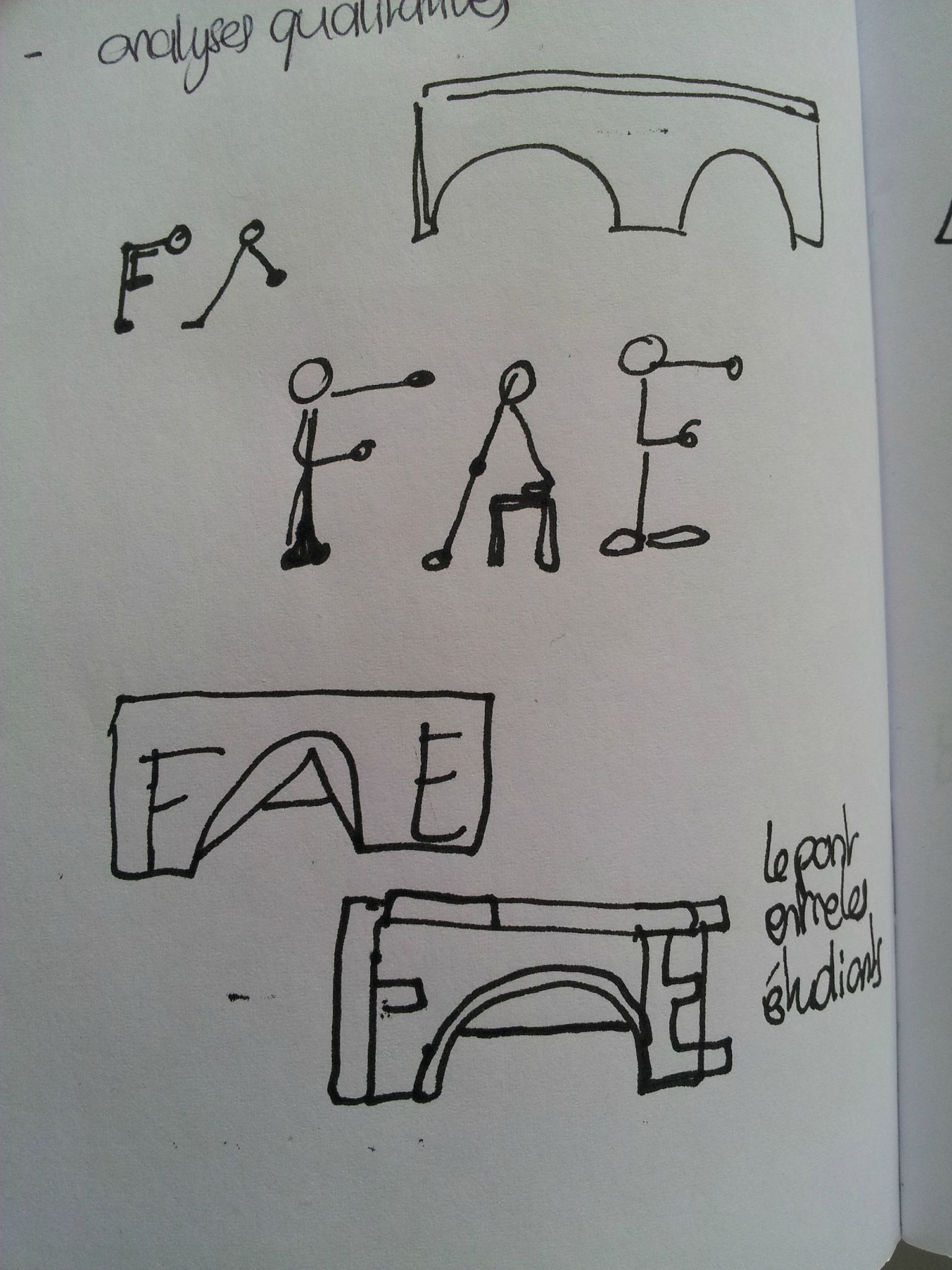
The FAE is a bridge between the different parts of the university: the students, the direction, the associations etc.
I made my bridge design according to a fairly representative brdige in Lausane: the Grand Pont. Behind it one can see another very iconic building of Lausanne: the cathedral.
Below, you will see the first sketches I made while researching the idea. The bridge idea came as I saw a bridge frome the metro's window... a proof that the environment is important to be creative!


I'm not the only one to have been inspired though: below you'll find a glimpse of the participations, more than 100!
 clic on the picture to go on the FAE's website ;)
Feel free to give me your opinion! Seeing it amongst the other participations, I think that my letter design is a bit thin...
Also, the pink is a bit bright there, but the version I sent was different... I think the file didn't really like being converted to jpg :)
We'll see, results should be published by the end of may!
Partager cet article


/https%3A%2F%2Fstorage.canalblog.com%2F86%2F64%2F960346%2F99623809_o.jpg)
/https%3A%2F%2Fstorage.canalblog.com%2F44%2F25%2F960346%2F98210419_o.jpg)
/https%3A%2F%2Fstorage.canalblog.com%2F24%2F03%2F960346%2F98209021_o.jpg)
/https%3A%2F%2Fstorage.canalblog.com%2F59%2F65%2F960346%2F97673734_o.jpg)
/https%3A%2F%2Fprofilepics.canalblog.com%2Fprofilepics%2F4%2F2%2F428118.jpg)